Analysing Daily Expenses
Each day people spend money on various things. Every financial transaction holds a bunch of meta information. Instead of going to waste, that information can be used to learn about one’s tendencies. What percentage of money is spent on food? On transport? Travelling? How expensive are the cities that were visited? How much money is spent daily? Weekly? Monthly? Can we use the data to predict future expenses?
Objective of the study:
The objective is to answer a series of questions:
- What percentage of money is spent on groceries, activities, travelling…?
- What is the preferred public transport?
- How expensive is each city daily?
- How much money is spent daily?
- How much money will be spent in the upcoming days?
Collecting the data
Due to the specific nature of the objectives it is highly unlikely the needed data would have already been collected and published. That is why, starting from 19th of September 2018, I started keeping track of my daily expenses in the following form:
1   hrk - croatian kuna, amount of money spent in the currency of Croatia,
2   vendor - company that I bought an item/service from,
3   date - DD.MM.YYYY or DD.MM.,
4   description - specifically what I spent money on (ice-skating, food, bus, alcohol...),
5   meansofpayment - cash/credit-card/paypal,
6   city - lowercase name of the city,
7   category - more general than description e.g. (bus, train, tram) -> transport,
8   currency - three letter code of the currency e.g. HRK, EUR, PLN...,
9   country - lowercase name of the country (shortened name if possible e.g. czechia),
10  lcy - local currency, amount of money spent in the local currency of current transaction,
11  eur - euro, amount of money spent in euros,
12  tags - something that will remind me of the record,
13  recurrence - is the expense likely to be repeated (yes/no)
Questions 1-4 pseudo code
- read data
- fill empty data
- date - add year where needed
- country - get_country_from_city
- currency - get_currency_from_country
- currencies
- if hrk not set: hrk = lcy * get_rate(currency, ‘HRK’ date)
- if eur not set: eur = hrk * get_rate(‘HRK’, ‘EUR’, date)
- category - money pie chart
- public transport pie chart
- daily city expenses stacked bar chart
- daily expense bar chart
importing libraries
import pandas as pd                   # reading csv files and dataframes
import numpy as np                    # matrix manipulation
from datetime import date, timedelta  # date manipulation
from geopy import geocoders           # getting country names from city names
import requests                       # getting exchange rates for currencies
import matplotlib.pyplot as plt       # plotting processed data
reading data from a .csv file
df = pd.read_csv('./expenses.csv')
print(df.iloc[90:130, :11])
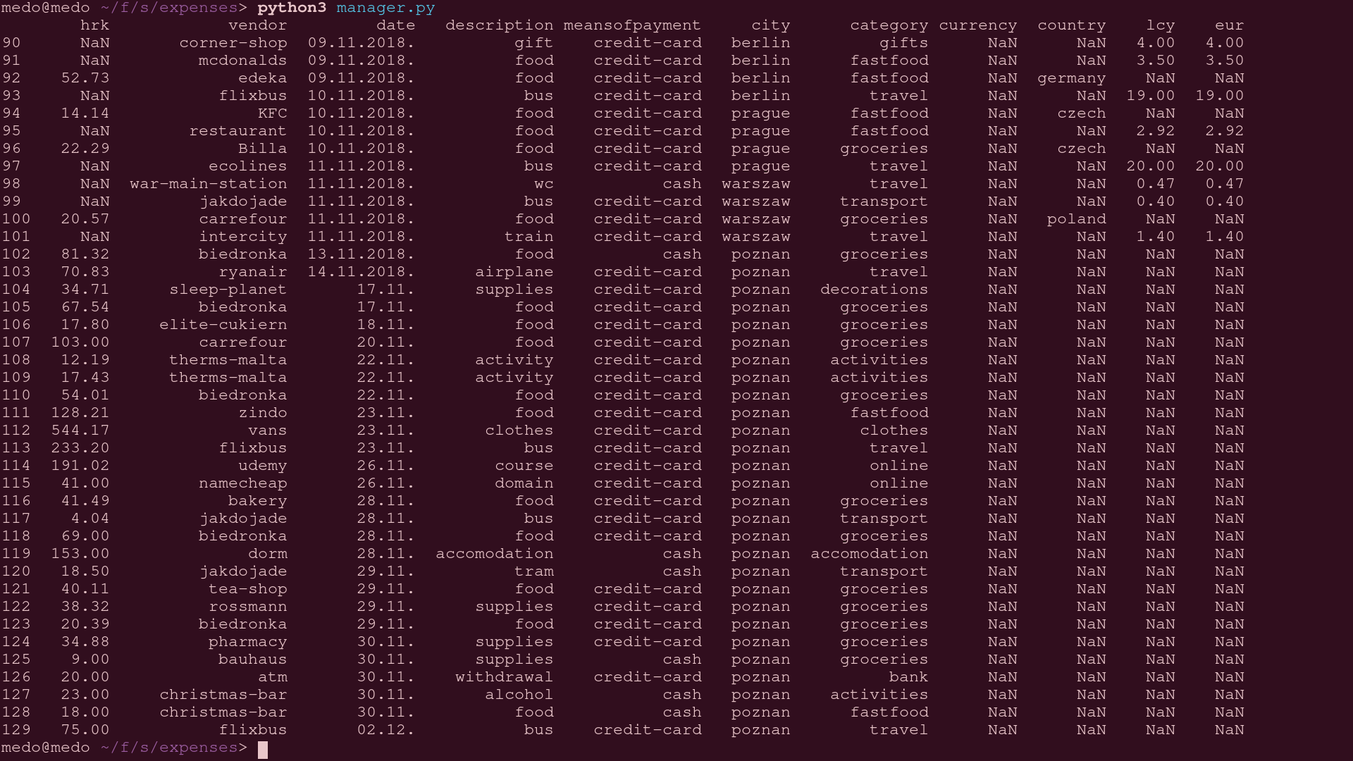
Upon quick inspection one can denote the marginal scarcity of data in the last few columns. What is more, in the last couple of rows the dates aren’t even fully completed. Throwing a glance at the pseudo code provided above one can fleetly conclude that is not a problem. All the missing data can be filled from what we already have.
- date -> add year where needed
- country -> get_country_from_city
- currency -> get_currency_from_country
- if hrk not set: hrk = lcy * get_exchange_rate(currency, ‘HRK’, date)
- if eur not set: eur = hrk * get_exchange_rate(‘HRK’, ‘EUR’, date)
Fortunately non of the relevant information is missing (cost) for any of the entries, but if there were for such entries the mean of the column would replace the empty record.
The data will be processed in one swoop, the goal is to iterate over the data set only once.
def city_to_country(city):
    gn = geocoders.GeoNames("", "<---myUsername--->")
    return gn.geocode(city)[0].split(", ")[2].lower())

def get_exchange_rate(base_currency, target_currency, date):
    if base_currency == target_currency:
        return 1
    date_formatted = "-".join(date[:-1].split('.')[::-1])
    api_uri = "https://free.currencyconverterapi.com/api/v6/convert?q={}&compact=ultra&date={}"\
        .format(base_currency + "_" + target_currency, date_formatted)
    api_response = requests.get(api_uri)
    if api_response.status_code == 200:
        return float(api_response.json()[base_currency+"_"+target_currency][date_formatted])

country_to_currency = {
        'croatia': 'HRK',
        'poland': 'PLN',
        'italy': 'EUR',
        'germany': 'EUR',
        'sweden': 'SEK',
        'denmark': 'DKK',
        'czechia': 'CZK',
        }

def transform_row(r):
    if len(r.date) == 6:
        r.date += '2018.'
    d = r.date[:-1].split('.')
    r.date = date(*map(int, d[::-1]))
    r.country = city_to_country(r.city)
    r.currency = country_to_currency[r.country]
    if np.isnan(r.hrk):
        r.hrk = r.lcy * get_exchange_rate(r.currency, 'HRK', r.date)
    r.eur = r.hrk * get_exchange_rate('HRK', 'EUR', r.date)
    return r

df = df.apply(transform_row, axis=1) # applying the function to each row
print(df.iloc[90:130, :11])
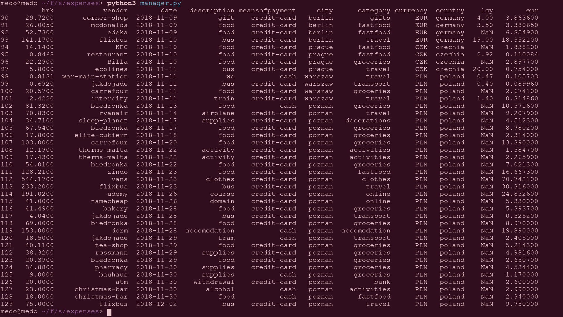
Most of the data is filled, the data that isn’t won’t be used in plotting our graphs anyway so there is no need to fill out the rest. Now it’s time to start answering questions!
What percentage of money is spent on groceries, activities, travelling…?
Grouping the entries by category and assigning the sum of money spent to each of them is the way to go. This can be best presented with a pie chart.
category_sum = []
for category, rows in df.groupby(['category'])['eur']:
    category_sum.append((sum(rows.values), category))
sums, labels = zip(*sorted(category_sum, reverse=True)[:11])
explode = [0.1]*len(sums)

fig1, ax1 = plt.subplots()
ax1.pie(sums, explode=explode, labels=labels, autopct='%1.1f%%',
        shadow=True, startangle=0)
ax1.axis('equal')
plt.title('percentage of money spend on each category')
plt.show()
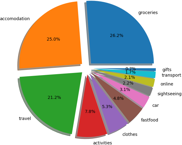
The chart isn’t all that surprising. What maybe catches one’s eye is the transport cost which seems unbelievably low. That is merely due to my habit of mostly walking. Even more so when everything is close, like it is in Poznan.
What is the preferred public transport (including travelling)?
This is a very similar problem to the one above. Entries are to be grouped by description where the category value is ‘transport’ or ‘travel’. An important note is that personal transportation (car/motorbike) is excluded.
preferred_transport = []
for desc, rows in df.groupby(['description']):
    if all(i in ['travel', 'transport'] for i in rows['category']):
        preferred_transport.append((sum(rows['eur'].values), desc))

sums, labels = zip(*sorted(preferred_transport, reverse=True))
explode = [0.1]*len(sums)

fig1, ax1 = plt.subplots()
ax1.pie(sums, explode=explode, labels=labels, autopct='%1.1f%%',
        shadow=True, startangle=0)
ax1.axis('equal')
plt.title('preferred public transport')
plt.show()
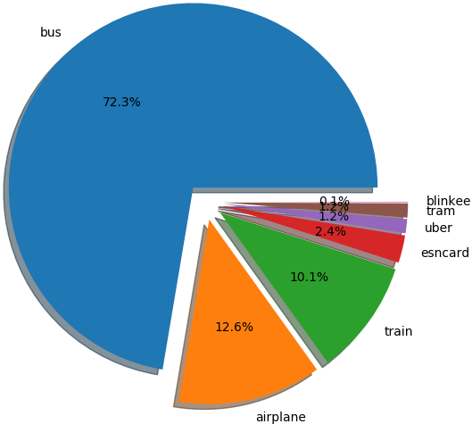
This chart poses more questions than it answers, but, since this should be somewhat of a short read it is beneficial not to delve into the depths here because more interesting things are on the radar.
How expensive is each city daily?
What could be done is, rinsing and repeating, pie chart spewing. But! This question can be answered in a flashier manner. Namely, since the data contains what was the money spent on during each day, that information can be plotted on the graph as well. All the travel information must be excluded!
all_categories = tuple(set(df['category']) - set('travel'))
cities_daily = []
for city, rows in df.groupby(['city']):
    days = set(rows['date'].values)
    days = (max(days) - min(days)).days + 1
    descs = {desc: sum(rs['eur'].values)/days for desc, rs in rows[rows['category'] != 'travel'].groupby(['category'])}
    cities_daily.append((city, tuple(descs[i] if i in descs else 0 for i in all_categories)))

cities, sums = zip(*sorted(cities_daily, reverse=True, key=lambda t: sum(t[1])))
sums = list(zip(*sums))

ind = np.arange(len(cities))
width = 0.35
colors = ['maroon','c','orange','k','b','darkmagenta','g','m','yellow','r','peru','navy','cyan','plum','grey','teal','lime']
bars = [plt.bar(ind, sums[0], width, color=colors[0])]
for i in range(1, len(all_categories)):
    bars.append(plt.bar(ind, sums[i], width, bottom=list(map(sum, zip(*sums[:i]))), color=colors[i]))

plt.title('amount of money spent daily per city')
plt.xticks(ind, cities)
plt.yticks(np.arange(0, 26, 1))
plt.legend(list(zip(*bars))[0], all_categories)
plt.show()
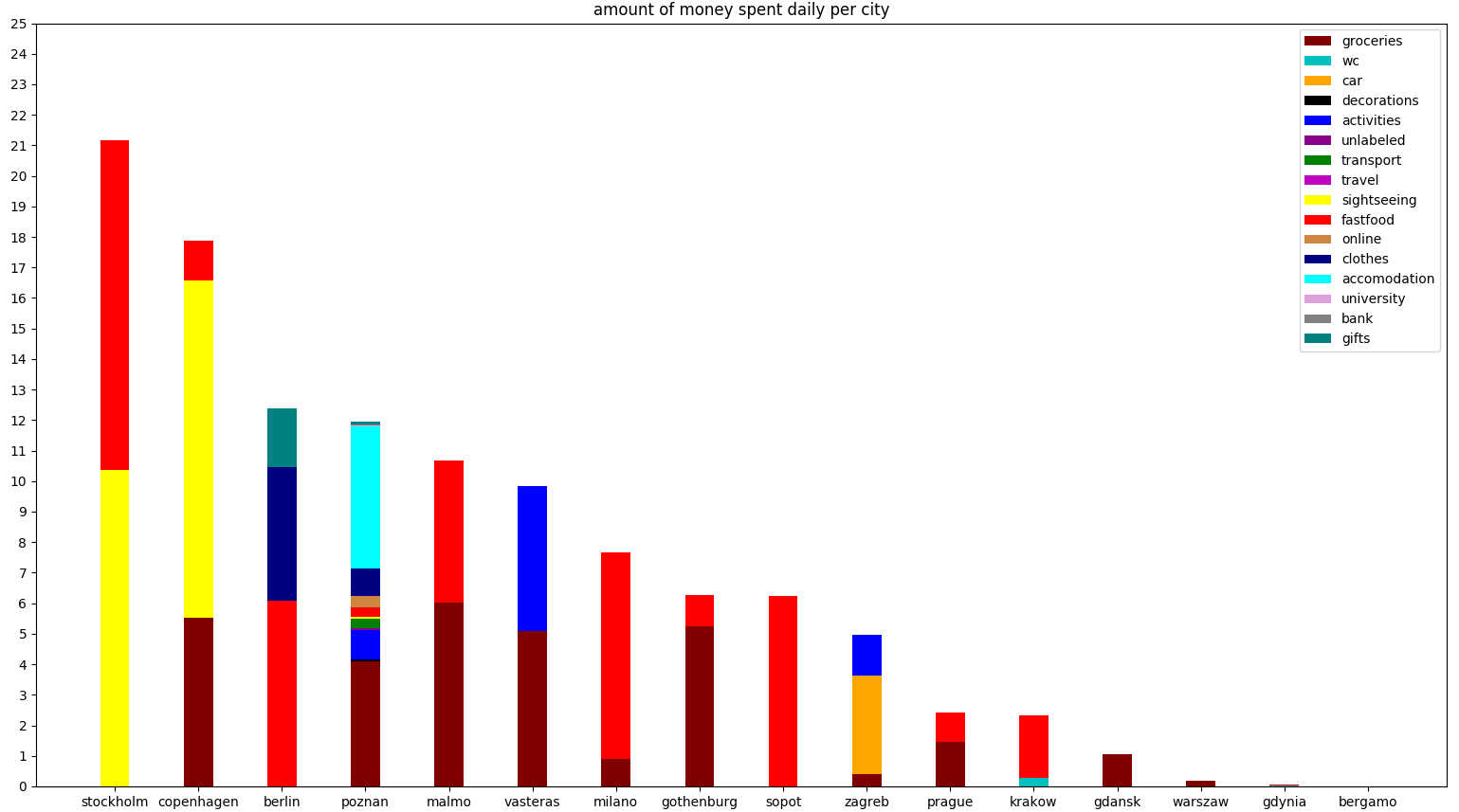
What does this chart tell us? Firstly, pizza hut’s Big cheesy B is not worth 20 euros (the Stockholm fast food expense), even if you split the bill with your significant other. Secondly, a banana in Sweden is more expensive than lunch in Poland… Jokes aside, one can notice that even when accommodation is free, travelling is really expensive when you don’t have a kitchen.
free accommodation was made possible through couch surfing, sleeping by friends, in buses/trains, etc.
On a further note, instead of just getting rid of the ‘travel’ category, it would have been advantageous to drop categories such as ‘clothes’, ‘gifts’ and other minorities although the difference is barely noticeable.
How much money is spent daily?
Instead of just summing the amount of money for each day, let’s extract the information like which city belongs to which day. Doing things this way will already have the data prepared for doing a little bit of computer science predicting the future expenses later on.
daily_expenses = []
cities = []
all_dates = list(pd.date_range(min(df['date']), max(df['date']), freq='D'))
for d in list(all_dates):
    value = sum(df[df['date'] == d.date()]['eur'])
    if value:
        cities.append(df[df['date'] == d.date()]['city'].values[-1])
        daily_expenses.append((d.date(), value))
    else:
        all_dates.remove(d)
dates, sums = zip(*daily_expenses)

ind = np.arange(len(all_dates))
plt.bar(ind, sums, color='red', width=0.35)
plt.xticks(ind, list(range(len(all_dates))))
plt.title('daily amount of money spend')
plt.xlabel('day number')
plt.ylabel('amount of money in eur')
plt.show()
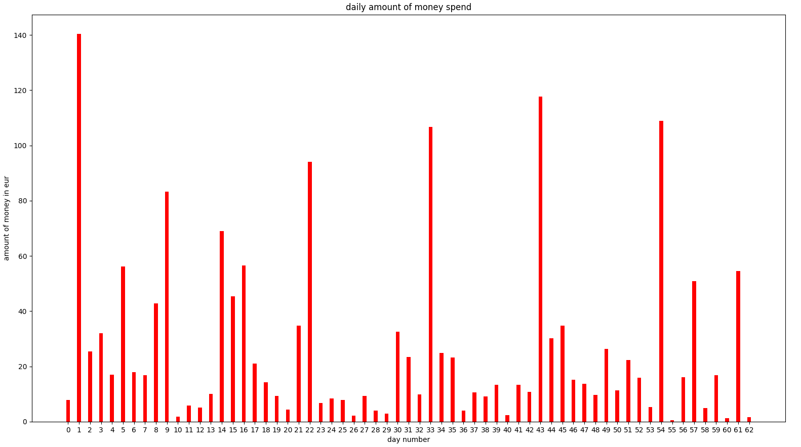
The severe peaks do not belong to travelling, it’s weekly shopping and rent that causes such irregularities. It looks like the data is going to need some clipping, but let’s not be pessimistic just yet. We’ll revisit this if it amounts to a problem.
What about question 5?
how much money will be spent in the upcoming days?
Usually, this would be approached differently; One would try to evaluate which machine learning method would be best suitable for adapting to the plotted function. But in this case, we’ll pretend to be British empiricists, turn a blind eye and just do the simplest method.
Linear regression pseudo code
- pre-process
- convert data into a daily table, with dates and city information
- encode categorical data
- avoid the dummy variable trap
- split data into test and train sets
- feature scale
- build our regression model
- fit the regressor to the train set
- remove columns that are not beneficial 1. backward elimination
- predict values
- plot results
Multiple linear regression
The city column has to be encoded into
x = np.array([*zip(range(len(dates)), cities)])
y = sums
from sklearn.preprocessing import OneHotEncoder
from sklearn.compose import ColumnTransformer, make_column_transformer
preprocess = make_column_transformer((OneHotEncoder(), [-1])).fit_transform(x)
x = np.array([*zip(preprocess, x[:, 0])])
Now we have to avoid the dummy variable trap.
x = x[:, 1:]
Next up is to split the data into test and train sets.
80% of the data will be used to train the model, and the rest used for the test set.
ytest is the test data we’ll compare the regression results to.
from sklearn.model_selection import train_test_split as tts
xtrain, xtest, ytrain, ytest = tts(x, y, test_size = 0.2)
Following the pseudo code the regressor should be created and fit to the training set.
from sklearn.linear_model import LinearRegression
regressor = LinearRegression()
regressor.fit(xtrain, ytrain)
ypred is the list of predicted values using multiple linear regression with
all the data available (dates, cities).
ypred = regressor.predict(xtest)
What we could do now is compare the results to the ytest and call it a day.
But we’re not going to stop there, let’s ask ourselves a question.
How beneficial is the abundance of information we’re feeding to the regressor?
Let’s build a quick
backward elimination
algorithm and let it choose the columns it wants to leave inside.
We’ll set the p-value
to the standard 0.05, sit back, relax, and let the magic unfold.
import statsmodels.formula.api as sm
xopt = np.hstack([np.ones((x.shape[0], 1)), x])
for i in range(xopt.shape[1]):
    pvalues = sm.OLS(y, xopt.astype(np.float64)).fit().pvalues
    mi = np.argmax(pvalues)
    mp = pvalues[mi]
    if mp > 0.05:
        xopt = np.delete(xopt, [mi], 1)
    else:
        break
Now all that’s left is to split the data again into test and training sets
and get the ypredopt, which is the predicted data of ytest after employing
backward elimination.
xtrain, xtest, ytrain, ytest = tts(xopt, y, test_size = 0.2, random_state = 0)
regressor = LinearRegression()
regressor.fit(xtrain, ytrain)

ypredopt = regressor.predict(xtest)
All that’s left is to plot everything and check out the result!
plt.plot(ytest, color = 'green')
plt.plot(ypred, color = 'navy')
plt.plot(ypredopt, color = 'red')
plt.ylabel('predicted value in eur')
plt.xlabel('days in the test set')
plt.show()
- green:
ytest, real points - navy/blue:
ypred, predicted points before backward elimination - red:
ypredopt, predicted points after backward elimination
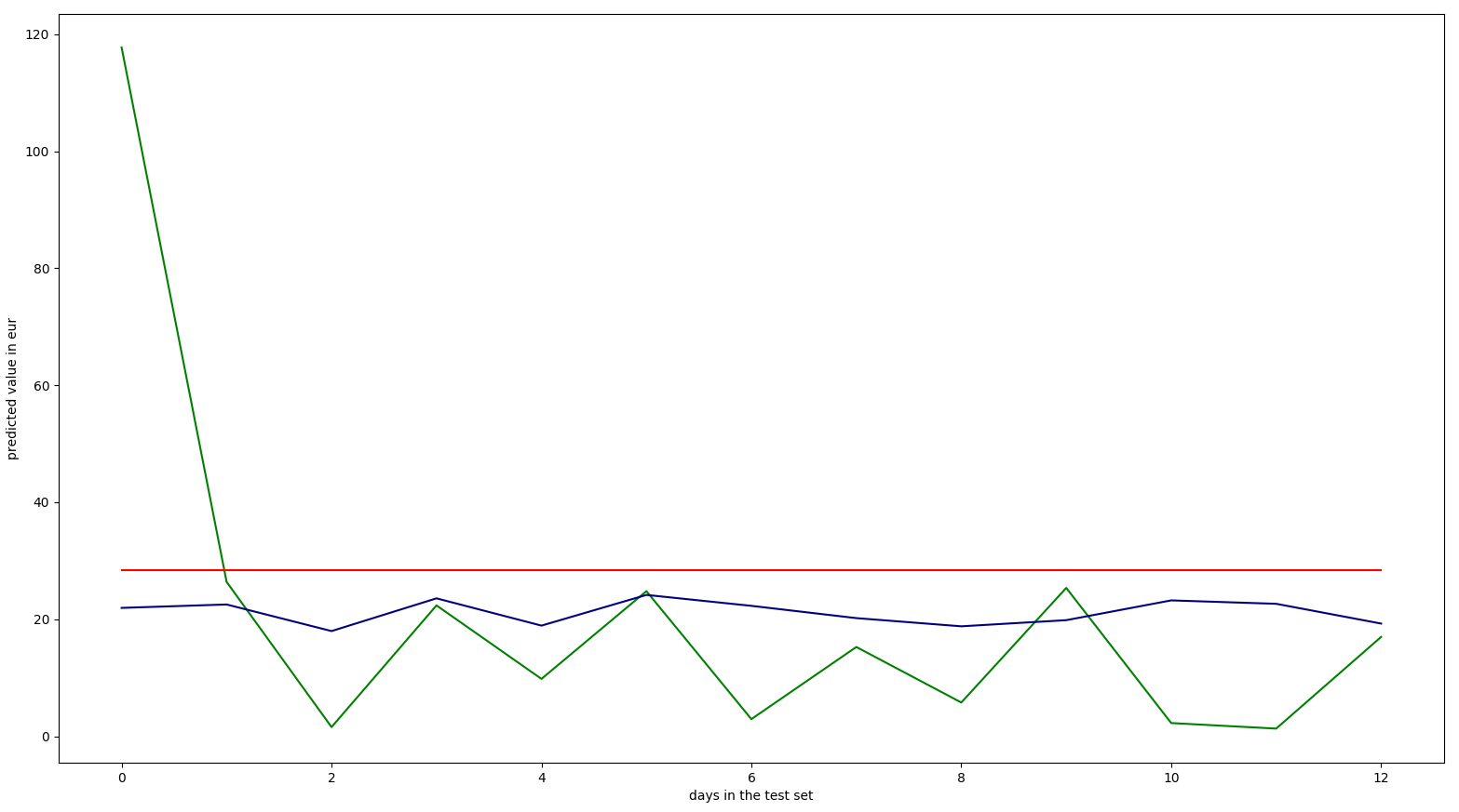
Initially the results put me in a spot of bother.
The backward elimination threw away all the data altogether.
But if we take into consideration the size of the dataset that is logical.
The reason that the predicted points before backward elimination are always
smaller in this sample is that ytest contains entries only for Poznan, the
column on the far left is so high due to weekly shopping.
Conclusion
Unfortunately graphs don’t speak for themselves. We can only assume what they might mean and try to prove it. One thing is certain, city information shouldn’t be discarded by the backward elimination process, but it also doesn’t make much sense to change the p-value. The culprit is the sample size, not enough information. Other than that the results are satisfying. The test results of the multiple linear regression predict the costs fairly well, exception being the peaks (weekly shopping).
Improvement ideas
The results would be more accurate if a bigger sample was provided. On the other hand it would be favourable to split travel expenses from daily basis costs. This could be further improved by clipping or distributing the peaks across weekly periods since shopping is done weekly.
Expansion ideas
- more models
- boosted tree decision
- poisson
- result comparison
- R^2
- mean absolute error
- root mean squared error
- relative absolute error
- visualization ideas
- heat map over the map of Europe
Afterword
Hopefully, this will always remain an ongoing project. The dataset won’t be updated due to it being personal information. I hope it is/was of help to someone.
Cheers!
